Subscribe to the blog
When you first got behind the wheel of a vehicle to learn how to drive, the dashboard probably seemed like a futuristic puzzle with its different gauges and numbers. More than likely, you didn’t turn on the ignition and hop on the highway without at least a quick tutorial to learn what all the instruments meant and their importance to the skill you were practicing.
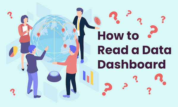
Just like driving, interpreting a business intelligence dashboard is confusing and daunting at first, but once you know what to look for in order to navigate it successfully, the ride is smooth sailing.
What is a Data Dashboard?
Before learning to read a data, or business intelligence, dashboard, you need to know what one is. This information management tool is used to visually track, analyze, and present key performance indicators (KPIs) and other relevant data that helps an organization benchmark their success. Most are customizable to fit the specific parameters of a department/company/process.
Data is pulled from your technologies and used to make insightful business intelligence decisions, letting you view the information in real-time and an easy-to-decipher format. The display is mainly shown via charts, tables, graphs, and gauges and lets you track multiple data sources simultaneously.
Building a Business Intelligence Dashboard
Consistent, reliable data is the most important component to getting the most value out of your business intelligence dashboard. But exactly how you get that data is open to interpretation based on your business’s goals.
Before you get started reading this whole article, would you rather hand it off to the pros? Let's talk!
Before you deep dive into the actual construction of your dashboard, consider five essential questions to ensure your final product is most effective.
- What are your organization’s desired business outcomes?
- Which departments/individuals are going to use the reports and how?
- What are the best ways to showcase the data (metrics, diagrams, graphs, etc.)?
- Are your KPIs easily replaceable and provide room for improvement as goals change or are modified?
- Do you have the appropriate data sources implemented to track important goals?
The next step is determining which KPIs you want to measure. The four main types of tracked KPIs include marketing, sales, financial, and project management. While KPIs from each category can be intermixed onto a single data dashboard, putting the metrics of each on a separate dashboard might provide the best results and allow you to measure and interpret KPIs more accurately. Some KPIs might be included on multiple dashboards as business intelligence reporting.
Deciding upon KPIs and building a dashboard(s) is a meticulous task and should be done with utmost care and expertise.
How to Make a Data Dashboard More Readable
IA dashboard is meaningless if the information on it speaks as a foreign language. Just like the car scenario mentioned above, you can’t actually operate the vehicle without knowing what the dashboard means or you risk an accident.
To improve readability consider the following tips:
Set straightforward objectives. Your dashboard’s purpose influences its design.
Only include relevant content. Your most helpful KPIs should remain the focus.
Use design to your advantage. The size and positioning of your data on the dashboard can represent an informational hierarchy so users know what data is most important.
Be consistent. Use the same types of visuals and layouts for easier comparison.
Use grouping. Put your correlated metrics together for easier readability.
Organize your numbers. Always round up your numbers for simpler understanding of changes. Be sure to differentiate between positive and negative numbers.
Clearly label. When labeling, use short and precise verbiage that users can quickly translate.
Continuous evolution. Data is always changing. Be sure to refresh your dashboard frequently so you are using the most up-to-date intelligence to make decisions.
Educate and Ask for Help
Once you have completed dashboards, the best way to ensure success is to provide a tutorial to users so they are up to speed on each metric. Accurate interpretation is essential for continued achievement. Use scenarios about what changes in each metric symbolizes and provide examples. If you still have trouble converting your organization to the effectiveness of business intelligence dashboards, contact us today.
We’ll be happy to do the work for you.